» ISP News »
Tesco Mobile Refreshes its UK Logo to Look Like Parent Firm
Monday, Sep 7th, 2020 (9:00 am) - Score 3,704
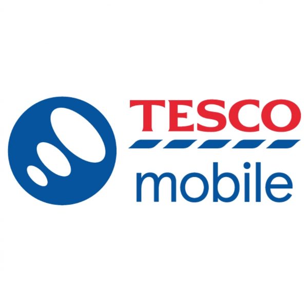
In a small development Tesco Mobile today appears to have conducted a brand (logo) redesign, which they say will aim to revitalise the brand expression and to align more closely with the wider Tesco family. Otherwise there doesn’t appear to be anything dramatically new.
Rachel Swift, CMO of Tesco Mobile, said: “From research we know the changes we’ve made have had a positive impact on how our brand is perceived, with more people than ever saying our new look and feels signposts quality and expertise. We’re proud to share our brand redesign, which takes us on to the next chapter of the Tesco Mobile story. Our new identity embodies our values and visually reinforces our position as part of the Tesco family.”


Tags:
By Mark Jackson
Mark is a professional technology writer, IT consultant and computer engineer from Dorset (England), he also founded ISPreview in 1999 and enjoys analysing the latest telecoms and broadband developments. Find me on X (Twitter), Mastodon, Facebook, BlueSky, Threads.net and Linkedin.
Mark is a professional technology writer, IT consultant and computer engineer from Dorset (England), he also founded ISPreview in 1999 and enjoys analysing the latest telecoms and broadband developments. Find me on X (Twitter), Mastodon, Facebook, BlueSky, Threads.net and Linkedin.
Latest UK ISP News:


Top News of the Week:


Cheapest Big ISPs for 100Mbps+:


Community Fibre £19.00

Vodafone £22.00
Youfibre £23.99
Virgin Media £23.99
Plusnet £24.99
NOW £25.00
Previous Article
« CBI Joins Calls for Infrastructure Bank to Fuel 1Gbps Broadband
« CBI Joins Calls for Infrastructure Bank to Fuel 1Gbps Broadband
Next Article
Vodafone UK Named Fastest for 5G Mobile Broadband in London »
Vodafone UK Named Fastest for 5G Mobile Broadband in London »


Sponsored
Copyright © 1999 to Present - ISPreview.co.uk - All Rights Reserved - Terms , Privacy and Cookie Policy , Links , Website Rules , Contact
so, the refresh is just recolouring Tesco in red? How much did that cost them?
Why? Pointless comment.
Nope.
Also changed the bit in the circle to be facing the opposite way to previously and removed the 3D effect, changed the mobile text and dashed bars from grey to Tesco’s corporate blue.
So I’m guessing, around £500k.
I think the rebrand look good and it feels more like Tesco, I hope the quality of service remains the same as before “which is excellent”