Researcher Publishes New Map of Broadband Speed in the United Kingdom
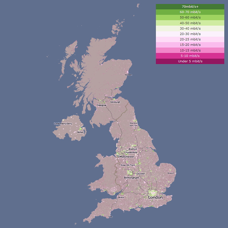
A senior researcher at the University College London‘s (UCL) Department of Geography, Oliver O’Brien, has taken data from Ofcom and used it to produce a new map of estimated broadband speeds across the country, which reveals some very familiar Digital Divides between different areas.
The interactive map claims to depict “actual average download speed based on the deal people have signed up for, not the maximum attainable download speed (either theoretical or actual) in an area“. Since this is Ofcom’s “most recent” data then the figures probably reflect optimistic estimates (sync speeds), which often perform a bit better than real-world connections.
Another problem is that the data was compiled by the regulator during June 2016, which makes it over a year out of date (we’ve seen the coverage of “superfast broadband” increase by around 5%+ since then – mostly in rural areas) and on top of that there’s no split by different broadband technology types.
Advertisement
Nevertheless the map still does a good job of showing the broadband slowspots in both urban areas (e.g. central London) and many rural locations (dark red areas), although ideally this sort of data should be contrasted against raw network availability. Many people live in areas with a faster service but they haven’t yet chosen to upgrade.
We should point out that Ofcom have their own Broadband Coverage Maps and Thinkbroadband also do a whole bunch of clever things to display maps by both technology and their own speed testing.

Mark is a professional technology writer, IT consultant and computer engineer from Dorset (England), he also founded ISPreview in 1999 and enjoys analysing the latest telecoms and broadband developments. Find me on X (Twitter), Mastodon, Facebook, BlueSky, Threads.net and Linkedin.
« UK ISP Plusnet Slash 12 Month “Fibre Broadband” Prices for July 2017


Comments are closed