Which? Reveals Best and Worst UK Areas for Mobile Signal via New MAP
Consumer magazine Which? has today teamed up with crowdsourced network benchmarking firm Opensignal to produce a new UK map of mobile network quality. The map uses real-world data to create a percentage score for how consistent the signal is in each postcode area in the year to August 2025 – split by EE, O2, Three UK and Vodafone.
The map itself is said to be based on over 17 million network tests taken across the UK over the last 12 months from users of Opensignal apps, which is partly the same sort of data that was recently used to help create Ofcom’s new Map Your Mobile tool. The data unsurprisingly reveals that the quality of mobile coverage varies dramatically across the country, and this can be significantly impacted by your choice of mobile operator.
However, we must also remember that mobile network coverage and performance remains a difficult thing to study, not least because end-users are always moving through different areas (indoor, outdoor and underground), using different devices with different capabilities and the surrounding environment is ever changeable (weather, trees, buildings etc.).
Advertisement
All of the above can impact signal quality, and that’s before we even consider any differences in local network (backhaul) capacity or spectrum usage between mast locations (cell sites). But despite this, Which?’s study of the new map and data was able to reveal that postcodes in Wales and the South West (England) were rated as having the “patchiest and most unreliable mobile experiences” in the UK.
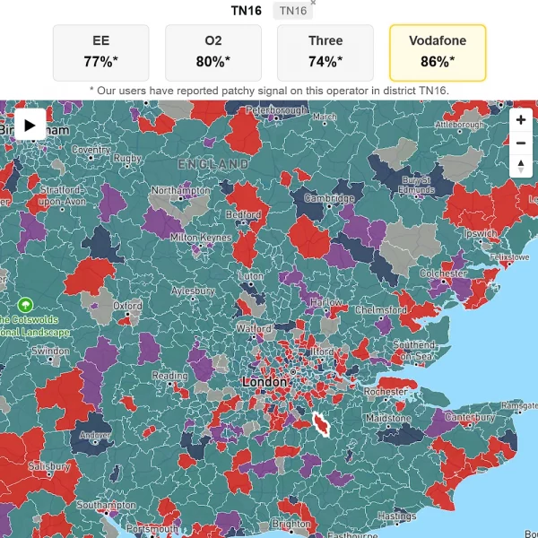
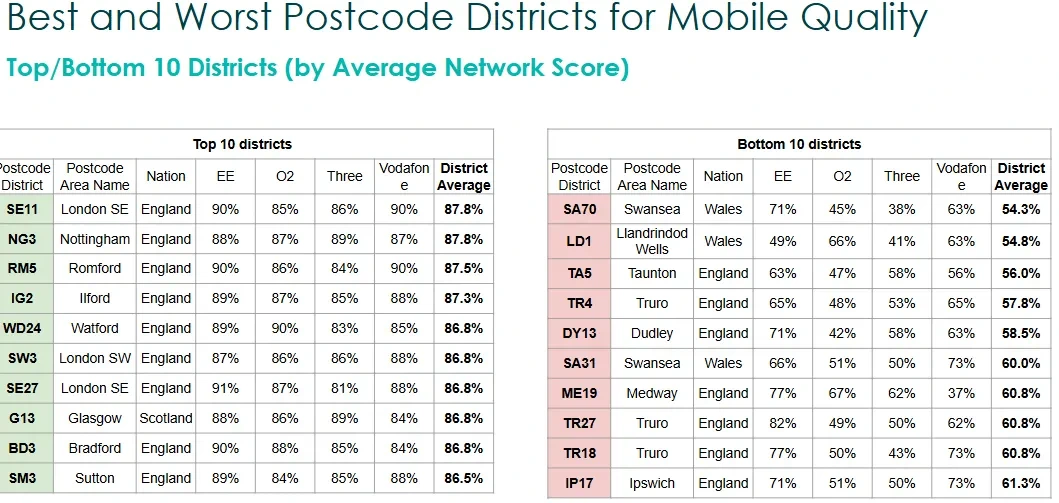
For example, SA70 in Tenby – a popular seaside tourist destination – was named the worst postcode for mobile network quality. Mobile users only experienced a good connection 54.3% of the time (i.e. 38% on Three UK, 45% on O2, 63% on Vodafone and 71% on EE).
On the flip side, SE11 in London delivered the best postcode score of 87.8% (i.e. EE + Vodafone on 90%, Three UK on 86% and O2 on 85%), but it was closely tied with NG3 in Nottingham. It’s no surprise that the big urban areas typically achieve the best mobile signals.
Advertisement
The map itself colour codes each postcode district to show which mobile operator delivered the best network signal (i.e. EE is a darker green, Vodafone is red, Three UK is purple and O2 is a dark blue), although sadly it doesn’t allow users to split the results by mobile broadband technology (e.g. 4G vs 5G).
Finally, we must remember that signal quality doesn’t always reflect the data / broadband performance of an operator. Sometimes you can have an excellent signal, but still get slow data speeds, such as due to limits on local capacity etc.
Which?’s Mobile Quality Map
https://www.which.co.uk/…/mobile-phone-coverage-map


Mark is a professional technology writer, IT consultant and computer engineer from Dorset (England), he also founded ISPreview in 1999 and enjoys analysing the latest telecoms and broadband developments. Find me on X (Twitter), Mastodon, Facebook, BlueSky, Threads.net and Linkedin.


Awesome tool, thanks for sharing this
South West has the worst signal quality as proven here. I’ve been saying this for years now.
They should include the percentage of the average number of samples per month per postcode vs the population of the postcode to indicate how reliable their figures are.
Some postcodes might attract a suitable number of samples, but this is unlikely to apply everywhere across the country.
The map is also very small; could they not make it any smaller?
4/10
I use open signal and I wondered how they accounted for places where there was no signal. Judging from the results for my postcode and surrounding area they ignore the failed tests, so giving an overstated coverage
Having used O2 for a few years in South West London, never really had an issue with Signal but internet/access was abysmal, non functional.
New Malden / Raynes Park / Wimbledon – couldnt even load Google maps!
Raised multiple times with O2, always said a mast issue blah blah, they send updates for a few weeks, then close out the ticket.
As great as it is to see predicted signal, it doesn’t show actual real world peformance I take these with a pinch of salt, always test a new provider with a pay as you go SIM or similar